Red Letter Day

Friday, December 21, 2007

One laptop, poor child

Sting will not be able to save the rain forests, and Bono can't do shit for Africa, but nonetheless, idealists, no matter how earnest and annoying they can be, really have made this a better planet upon which to live. I admire the people behind the One Laptop Per Child (OLPC) initiative, and believe that a program which has as its goal increasing the penetration of inexpensive and easy-to-use networkable computing power to those without access to such things is an unabashedly Good Thing.

Unfortunately, when the rubber hits the road, so to speak, OLPC falls on its face. Continuing the Western tradition of sending its garbage to the Third World, the OLPC can charitably be described as, well, not very good - a grossly underpowered computer with perhaps one of the worst user interfaces ever seen on a device meant to be used by ordinary people. The slowness of the device is not a deal-killer. If the choice is between a computer or no computer, waiting 15 seconds to switch between applications is not a big deal. And on a pure hardware level, the OLPC is an impressive thing for $200 -- with a rugged, water resistant case, wifi, a small but decent color display, innovative landscape and eBook modes, and even a video camera and microphone.

However, all this innovation is destroyed by the UI. There is no way around it. It is horrible - menu-based DOS systems had easier to understand interfaces. Nobody who has ever used a computer will be able to understand the UI, and I would wager that even those who have never touched a PC will be lost. A traditional windowing system was not used for the logical reason that the display was too small. I understand this. However, the alternative would seem to be big, colorful icons that are easily understandable. Instead, though, the main OLPC UI is a confusing collection of tiny abstract shapes, little X's and O's of various colors randomly strewn about across the screen. There's an application launch bar, but it is hidden in the default view. Even once you manage to launch an application, there's no obvious way to control it, no menus, icons, or anything. The OLPC comes with a lot of interesting applications, including various music, web surfing, painting, basic programming, and writing tools, all of which could be useful for children, but each one suffers from the same horrible basic UI that makes any kind of actual use nearly impossible.


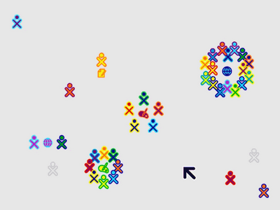
Tell me, Dave, which one is the OLPC PC, and which one is Robotron 2084?

The operating system (and UI) are open source, but I do not think this is a problem; after all, Ubuntu Linux is open source and its collaborators have managed to create a beautiful and functional UI. Rather, I think the development of the interface was done ad-hoc, without any real-world testing, by people who operated under completely misguided perceptions of what makes a computer easy or hard to learn. And, because of this, the OLPC initiative now has a huge boat anchor wrapped around it, which will drag this project down, in spite of its innovative hardware and good intentions.

There's nothing that says a semi-charitable computer has to suck. It's a bit more expensive, but ASUS's eee PC addresses all of the OLPC's shortcomings, so it can be done. I think the OLPC folks have solved half the problem - they have designed a good piece of hardware; they just need to swallow their pride, and build a UI for the device that is useable by human beings, and then, perhaps, some of their goals might be within reach.

Update: Dave checks in with a great, detailed review of the OLPC unit.

Labels:

Saturday, December 08, 2007

Color Decoder Reviewed


Color Decoder 1.0 by Stray Cat Technology

"Colors" are not just the theme of a mediocre 1980s gang movie starring Sean Penn and Robert Duvall. We mammals perceive the world in color, including our computer screens. However, a significant portion of the population experience color vision deficiency (popularly and somewhat inaccurately known as "color blindness") where certain shades of color are unable to be properly perceived. Given that this is a fairly common phenomenon, and given how important color is in the Apple user interface, it seems rather surprising that Apple has neglected to handle color vision deficiency in their otherwise thorough Universal Access preferences. Luckily, Stray Cat Technologies has stepped up to fill this gap with their initial software release of Color Decoder.

Color Decoder is a simple application that does one thing - it tells you what color the screen is displaying underneath the mouse pointer. Color Decoder does this one of three ways; via a pop-up bubble the displays the color name, by speaking the color name out loud using Apple's voice technology, or by flashing all pixels on the screen that share that specific color. Any of these three methods of color notification can be used by themselves or combined, so for example you could have the computer speak the color's name and display it's name in a bubble, but skip the flashing, or vice-versa. These preferences are controlled from a small palette on the screen which is the application's entire user interface. Color Decoder's recognition system can be turned off or on entirely via a hot key in case you only need it on occasions. The only other user interface option is the ability to turn on a magnifying glass to see exactly where the mouse pointer is pointing, which can be very useful when trying to find a single colored pixel in a huge image.


In actual use, Color Decoder works exactly as advertised. After launching, the palette opens where you can select your settings (you can hide this window once you have things set up as you wish). I tried out all three of the methods for communicating color in turn. The color name display only is a very minimalist method of showing the color, and is very useful when you have images on the screen where color is important, especially things like charts, graphs and other documents which use color to communicate data. The "flash colors" feature works well on images that are more complex with many colors mixed together such as gradients, weather radar displays and similar items. For most daily use, naming colors, supplemented by flashing colors works well. Magnification is usually not needed, although it is nice when you are looking at very complex images where there may only be a few pixels you need to track down or see (in these cases, the flashing feature is excellent as well).

I wasn't as excited with the speak color name feature, where Color Decoder uses Apple's speech synthesis to actually say the color names out loud. I can see this be very useful to someone with severe vision deficiency, but in actual use, having this feature on resulted in a continuous stuttering stream of half-spoken color names as I moved the mouse around the screen. I think this feature would be much more useful if there was a longer delay between mouse movements and the color being spoken, or even better if you could assign a separate hot key to speak color names on demand without having to leave the feature on all the time.

This minor quibble aside, I found Color Decoder to be a very functional and useful piece of software. Those with color vision deficiency will absolutely want to check this program out, but I would also recommend that anyone who works with color on a regular basis give Color Decoder a test drive. It fills an important hole in Apple's OS and makes using a Mac easier for a large segment of the population, in a clean and elegant way.

Plusses: A great way for those with color vision deficiency to recognize and differentiate colors on the Mac; useful for designers and other users to find all examples of a particular color on a busy screen

Minuses: The spoken color feature could use some polishing

Summary: Color Decoder fills a gaping hole in Apple's otherwise fairly complete Universal Access accessibility preferences and is definitely worth a download for those with color vision deficiency or who work with colors.

Color Decoder by Stray Cat Technology.
Price: $21.95; fully-functional demo version works for 1 week
Requires MacOS 10.5 or higher

Labels: ,

Sunday, October 21, 2007

iMac 24 inch review


It certainly has a pretty face, but like it's celebrity brethren, does the new iMac have some brains behind her good looks?

Apple recently introduced their newest revision of the venerable iMac line of MacOS computers. The iMac is Apple's mainstream home desktop computer, designed to cover a wide variety of consumer needs. It truly is the computer for the masses, but how does it stack up? I recently purchased a new 24 inch aluminum iMac and after using it for nearly a month, I believe Apple has definitely scored another winner.

The iMac comes in two screen sizes, 20 inches and 24 inches, the latter being as large as Apple's 23 inch cinema display (remember how big those looked a couple years ago -- now that resolution is available on a relatively inexpensive consumer Mac!). All the iMacs have the same processor, Intel's zippy Core 2 Duo, with the only differentiator being your choice of 2.4 or 2.8 gigahertz speeds. Mine came with the 2.8 chip. Unfortunately, in an effort to shave an extra $50 off the price, Apple still shortchanges the iMacs with RAM, only shipping them with 1 GB standard. Luckily it is cheap, and easy to add additional RAM. You will want to put at least 2 GB if not more (up to a maximum of 4 GB) if you plan to do any more then basic web surfing.

The first thing anyone notices about the iMac is the screen. Controversially, Apple added a glass panel over the LCD itself, resulting in bright eye-popping color, but also introducing a possibly-annoying glare. I haven't noticed any glare myself, but still, perception of glare is a very personal thing, depending on your own eyesight and the lighting in your office or room. I would recommend finding a friend (or traveling to the Apple store) and spending a half hour using the iMac before making your decision. Unfortunately, Apple doesn't provide an option for a matte screen, although I expect eventually there will be third-party "enhancements" (the glass panel comes off easily, although I wouldn't try it at home!) Ironically, my own iMac arrived with a distracting speck of dust caught between the glass and the screen, necessitating a trip to the Apple Store in Kansas City.

So how is the iMac in day to day use? Very fast and very nice. It seems zippier then my "old" 2 ghz Mac Pro, and benchmarking tests bear this out, showing the iMac to be about 20% faster. Web surfing, using email, listening to music in Tunes, and editing photos in iPhoto are extremely fast, and the perception of speed is palpable. I also was very pleased with how fast Parallels ran on the iMac. Watching movies and TV shows on the huge screen, especially sitting back with the included Apple Remote is a pleasure as well. I use an Elgato EyeTV to record live television and combined with the iMac, this gives you a legitimate home entertainment center.

One unique feature of the new iMacs is that they come with a very different Apple keyboard (also available separately) which looks (and types like) the keyboard on the Macbooks. I have found the keyboard to be very pleasant to use, but like with the screen, I recommend trying out yourself first. Of course, if you don't like it, you can plug in any USB keyboard.

Other nice touches in the iMac include a firewire 800 port (new to this generation of iMac, and very useful for adding fast external storage), extra fully-powered USB ports on the keyboard, and built-in Wi-Fi and bluetooth, and of course the video camera, useful for iChat as well as fun with Photobooth.

What is the iMac missing? For a consumer machine, very little. The only obvious oversight by Apple is the continuing omission of a built-in card reader for the most common digital camera memory cards. Attaching an ugly external reader ruins Apple's clean lines, and given the design attention paid elsewhere, seems like an oversight. I also would like at least one USB port tucked away on the side of th iMac rather then the back, to make it easier to quickly attach a removable device. The workaround for this is, of course, a hub, once again, cluttering up the view! I should also note that, other then memory, the iMac has no user-upgradeable parts (most previous iMacs were this way too); if you ever think you might want to upgrade processors or hard drives, go with a Mac Pro.

In summary, despite some minor quibbles, the aluminum iMac is a winner. A powerful, fast consumer Mac that has long legs and will make a great Leopard machine for several years to come. Anyone in the market for a new Mac who doesn't require the portability of a laptop should consider the iMac.


Aluminum iMac
$1200 - $2300 depending on configuration and screen size

Plusses:
- Extremely fast and powerful mainstream desktop Mac
- Gorgeous screen and all-around good looking machine
- lots of built-in extras

Minuses:
- Standard RAM is barely adequate
- No built-in memory card reader


Best for: General consumer and home/family use, students, office use, public-facing areas, consumer-grade digital photography or video editing
Consider a laptop instead if you require portability
Consider a Mac Pro instead if you do commercial-grade video/graphic design work or engineering

(this post cross-posted to the LAUG blog)

Labels:

Wednesday, August 22, 2007

Gmailman

So for the past month, I have been trying an experiment of using Gmail exclusively for my email. I still receive messages sent to my mac.com and mikesilverman.com email addresses, but those mailboxes are accessed via Gmail. There are several advantages to using Gmail and a few disadvantages, but so far I am liking it and plan to keep the experiment going for a while longer. Ironically, the longer I use it, the worse Gmail's one huge disadvantage becomes (see below).

So what are the main "cool things" about Gmail?

1. Instant email access everywhere. I can instantly get to my email, both to read and reply, from almost anywhere; home, work, my cell phone, public computers, any place with an internet connection. No more do I have to Timbuktu home to check personal email, or have to check several different web sites to view email. It's all in one place. For the Macs I regularly use, I have downloaded Gmail notifier, which will alert me whenever a message arrives. Actually using Gmail is pretty good. It is still a web browser, but is flexible and interactive enough for most tasks that I have not really noticed the shortcomings of the web application versus a traditional email client, yet.

2. Conversations and tagging. Both of these are unique to Gmail and both take getting used to. Each helps tame the massive mess that emails can turn into. Conversations essentially collapses all emails in a single subject into one "line" in your email box. For example, a messy four-way conversation, sprawled out over a week between my friends and I about getting together for a concert shows up as a neat single line in Gmail, and when I read it, the entire conversations expands to show who said what when. It is essentially threading done very well. Tagging is another way Gmail lets you organize things; it works like folders in traditional email, but you can assign multiple tags to a message, so essentially you can place messages in multiple "folders" at once. It does take time to get used to Gmails non-use of traditional folders as a method of filing. To effectively use Gmail, you need to tag all messages you plan to keep (this can be automated) then "archive" them. AFter this becomes second nature, it really works well.

3. Effective spam filtering. Perhaps because of the huge corpus of spam Gmail users get and mark, Gmail's spam catching seems very effective, catching about 99% of all my spam. I get about 400 messages a day of spam, so that means 4 will get through per day on average, which is not bad, although like most automated systems, Gmail sometimes allows incredibly obvious spam messages to get through.

There are a few weaknesses in Gmail that you might want to keep in mind if you want to follow my experiment and try it yourself. Obviously, you have to trust Google to store your personal email. I am not to worried about this; any more then I worry about online banking or online shopping, but if it bothers you, then Gmail is probably not for you. There's also the targeted ads that show up when you read mail. Perhaps I am so jaded and used to advertising that I don't even notice.

As far as functional weaknesses, there are two major ones I have found. The first is that Gmail is a one-way process. You can import old mail into Gmail, but there is almost no way to effectively export mail out of Gmail back to your desktop (beyond kludges like forwarding all the mail to an external account). I like having a local backup of all my mail. The only way around this I have found is to turn on Gmail's own POP and use a local mail client to suck down all of your Gmail messages periodically. This sucks because it doesn't preserve any of your Gmail organization such as sent items, labels, and so forth. Gmail needs to provide an easy way to download all mail via a simple export command.

The second functional weakness is filters. Gmail allows for basic filtering to be set up, but it is rudimentary at best, allowing filtering based on only a couple criteria. You cannot build compound filters, or any kind of routing beyond the basic "if it came from Mom, label it family" kind of thing. This itself is probably a deal-killer for anyone who uses email in a hard-core, super-organized way, as opposed to people like me, who use email for basic correspondence. Gmail really needs to make filtering better, allowing the user to filter based on any header, and string filters together to make more complex recipes. Gmail should also allow the tagging and filtering of outbound mail.

In spite of these problems, I am liking Gmail for the light use that is my email, and I will keep using it at least in the foreseeable future. I just hope they continue to make improvements in the product and don't just rest on their laurels.

Labels:

Thursday, April 12, 2007

The cat is still in the bag

Apple faces reality.

Some questions to ponder...

1. How big is the shit-eating grin on the lips of Bill Gates, and does every Windows fan in the world know the definition of Schadenfreude?

2. "Cupertino has a cat, too. But it fell asleep."

3. Apple releases MacOS point updates about every 3-4 months. The last update was 10.4.9...does this mean there will be a 10.4.10?

4. First Apple dropped "Computer" from its name, now they have stated that working on a phone is more important then working on the operating system that powers their personal computers. Is this another sign that MacOS hardware and software is continuing to fade in importance at Apple?

5. Will developers finally really see "secret features" in June?

6. Does Steve Jobs wish he really had a "time machine?"

7. As far as I can remember, this is the first time since the mid 1990s - and the first time ever since Steve Jobs came back to Apple - that Apple has publicly missed an announced ship date of the MacOS.

All cattiness (pun intended) aside, I know from personal experience what it is like when corporate higher-ups decide that some other project has priority over the project you personally prefer. That's how things work in corporate America, and there's no reason Apple should be immune from this.

So, for now Tiger still works great. And hey, I could always run Vista on my Mac!

UPDATE:

And a couple more questions...

What will happen to iLife and iWork...will there be any releases at all this year for those products?

What about new Macs...Apple often links new hardware to new software...hopefully this will not result in delays for updated iMacs or laptops.

Labels:

Monday, February 05, 2007

You've been served!

My friend Rob has a great web site 'traffic ticket' that should be served to the webmasters of web sites that commit crimes against design or functionality. The form is a good start, but it needs a list of associated penalties as well, such as the webmaster of any site that has a "country" pop-up starting with "Afghanistan" has to actually move there for a year, and so forth.

Labels:

Sunday, February 04, 2007

Security begins at (XP) Home

"640K ought to be enough for anybody." - Bill Gates, 1981 (possibly apocryphal)

"Windows Vista is more secure than OSX 10.4.8" - security researcher David Maynor, 2007 (amazingly, not apocryphal)

Apparently, you see, there are all kinds of wild and crazy "security issues" that some super 133T H@X0Rs have mananged to exploit on MacOS systems, none of which any Mac user has ever stumbled upon in the wild and all of which have as much relevence to real world computer use as understanding the chemistry of hydrocarbons has to do with whether your Mom chooses paper or plastic at the grocery store.

I think the problem is that "security geeks" like David Maynor who keep trying to claim that Macs are not secure are completely divorced from how computers are used in the real world. They focus on technical exploits that might be extremely clever in the lab but have no relevance to what an average computer user would come across in actual usage.

Forget the technical minutiae of stack and heap exploits -- a real test would be to take two grandmotherly types, sit one down on a Mac and one on an average Windows PC and set them loose on the internet for an afternoon of surfing and emailing.

Which one will end that day with their computer clogged with spyware, unwanted porn pop-ups and a general slowdown of their computer?

Could anyone say with a stright face that it would be the Mac user?

That is what "security" means in the real world, not trivia about things like an "Apple SLP Daemon Service Registration Buffer Overflow Vulnerability"

Labels: